
ART DIRECTION. BRAND. STORIES. LEADERSHIP.
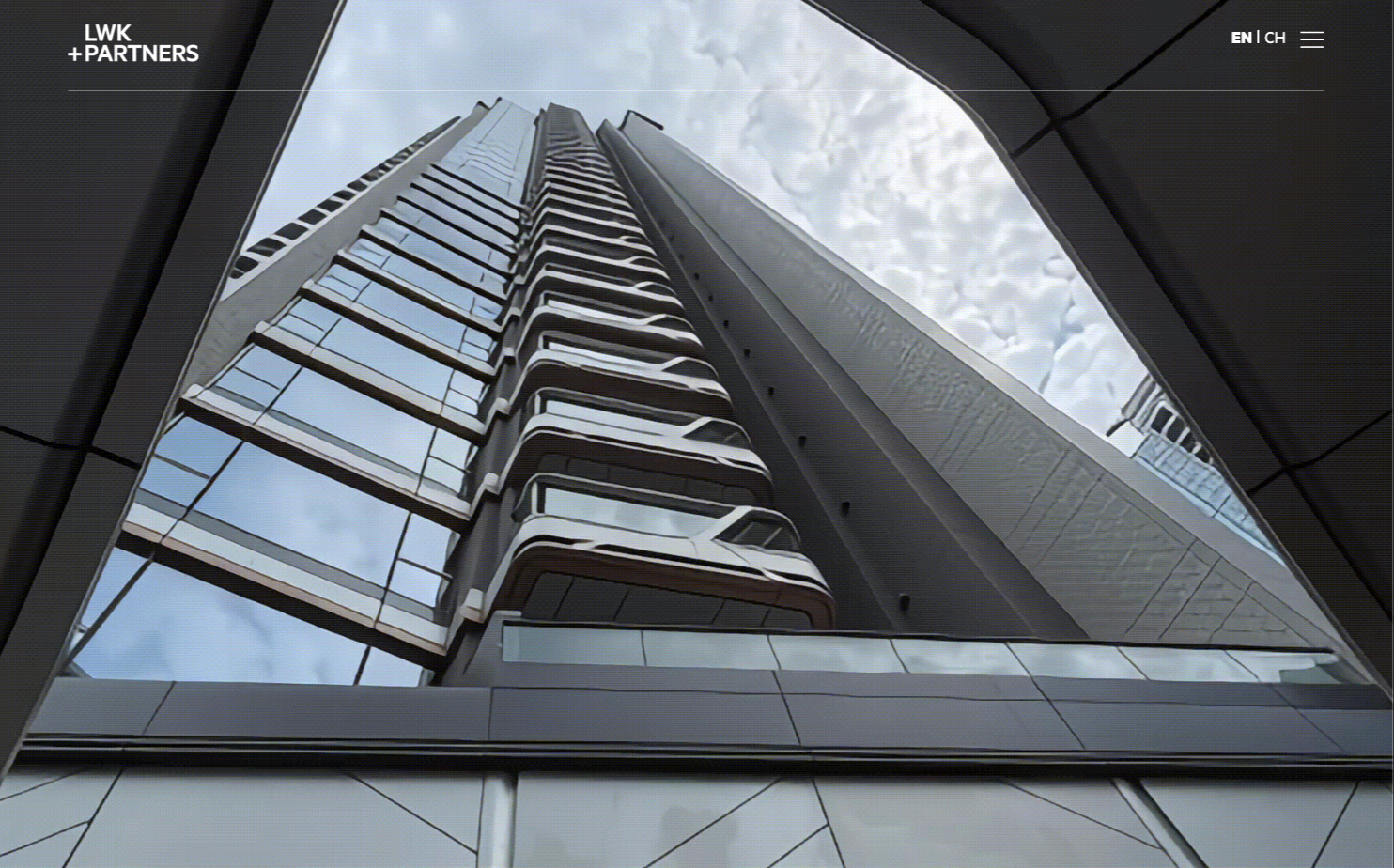
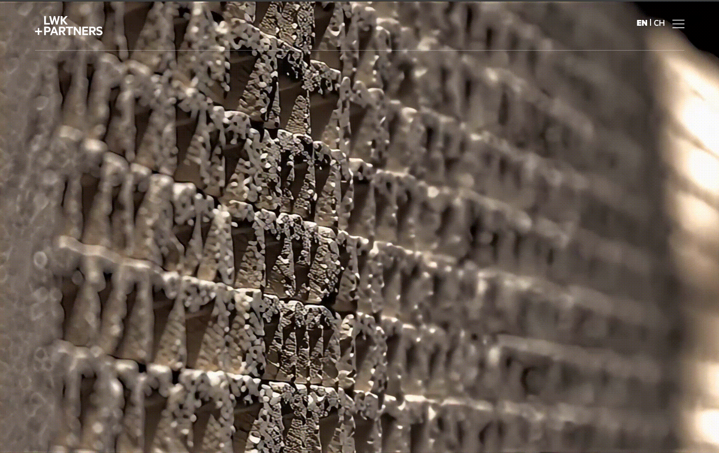
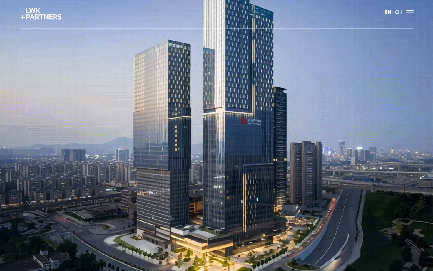
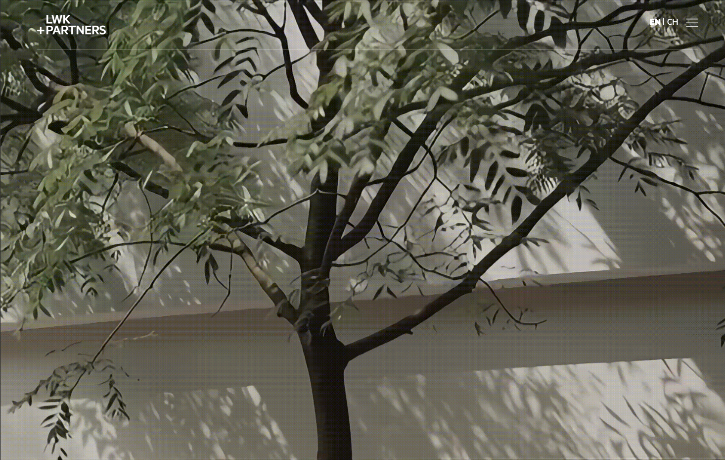
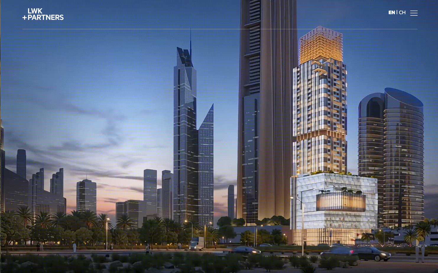
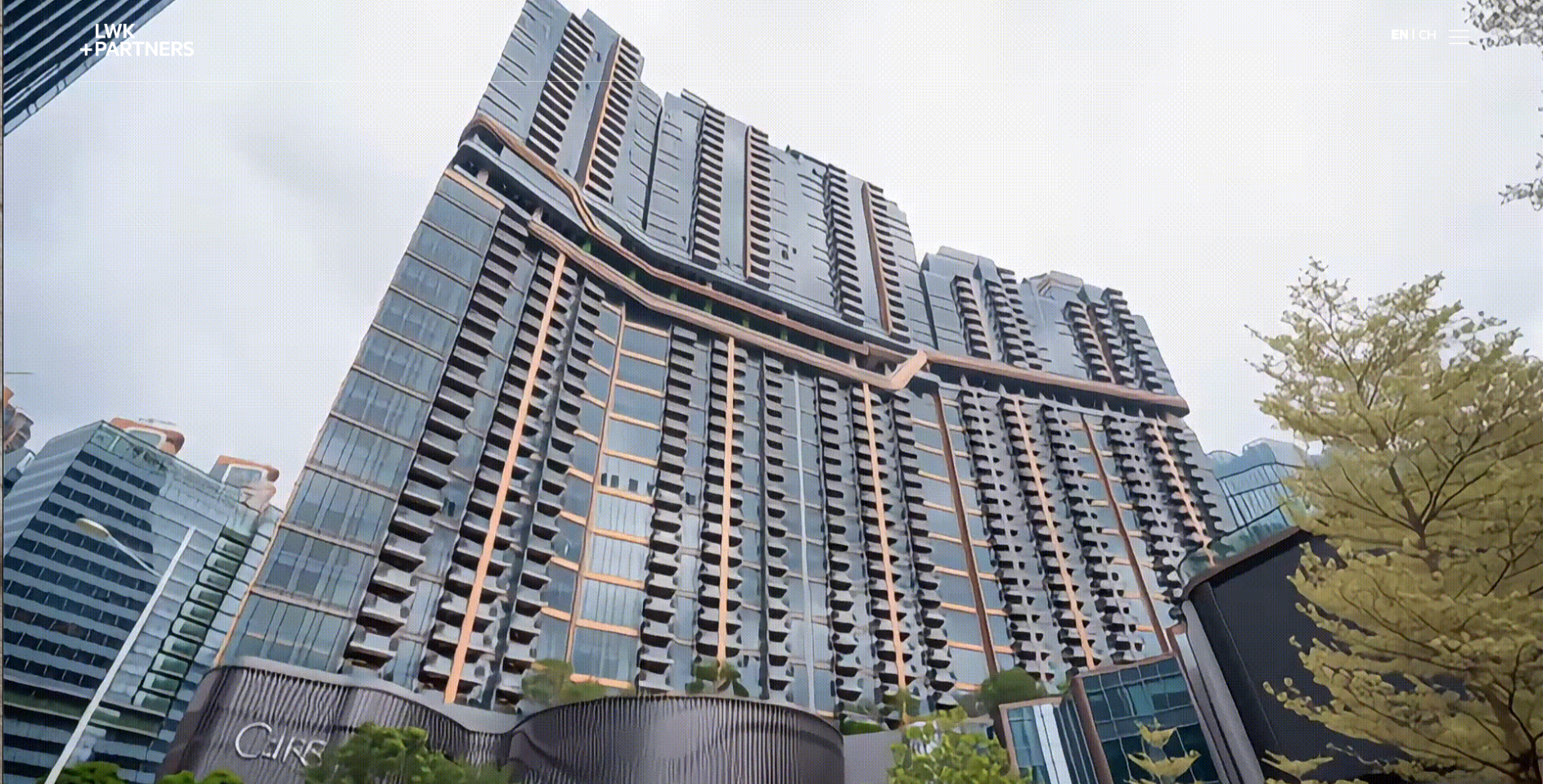
Building an opening animation for a global architecture and design firm like LWK + PARTNERS needed to feel structural, fluid, and premium. I wanted the motion design to mirror their philosophy of urban architecture, scale, and connectivity.
Here is a conceptual storyboard and motion framework tailored for a high-end brand reveal:
1. The Concept: "From Blueprint to Dynamic Form"
The animation should transition from the abstract, raw elements of technical design (lines, coordinates, grids) into a bold, solid brand mark, symbolizing how they shape physical spaces.
2. Motion Storyboard Breakdown
SequenceVisual ElementsMotion & Transition
00:01 - 00:02
The Grid
A minimalist, dark charcoal or deep canvas with ultra-fine, elegant vector lines drifting on an isometric axis.Subtle camera movement pulling backward, hinting at structural blueprints or an expansive urban grid.
00:02 - 00:04
The Intersection
The abstract lines begin to snap, fold, and converge rapidly toward the center, forming geometric intersections.High energy, sharp mechanical movements. The lines slice through the frame to suggest cutting-edge innovation and precision.
00:04 - 00:06
The Reveal
The geometric forms solidify into the heavy, structural blocks of the LWK letterforms.A swift shift from light vector wireframes to solid 3D or high-contrast 2D forms, using a sweeping light pass or texture reveal.
00:06 - 00:08
The Partner Connect
The "+ PARTNERS" typography slides out fluidly or unlocks seamlessly from the right edge of the logo mark.Smooth, tracking-out motion to give the text breathing room, easing into a perfectly balanced, elegant finish.
3. Visual & Styling Directives
Color Palette: Keep the background moody and cinematic (deep grays, off-blacks, or muted architectural tones) so that the core brand colors pop with premium intensity.
Typography: Maintain absolute crispness on the sans-serif typography. The tracking on "+ PARTNERS" should expand slightly as it settles to convey scale and global reach.
Texture: Consider incorporating micro-textures—like a faint brushed concrete or architectural paper grain—overlaying the solid shapes to add depth.
View at
https://www.lwkp.com/